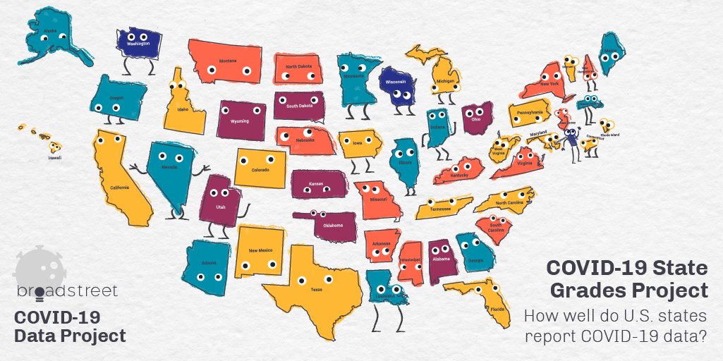
COVID-19 State Grades Dashboard
Click to explore the interactive dashboard
Project Overview
The COVID-19 Data Project is a remote internship program that has leveraged the expertise and contributions of more than 600 public health and data-oriented students, researchers, and practitioners since March 2020. With leadership and guidance from the Broadstreet team, the project’s volunteers are committed to procuring and exploring the most reliable COVID-19 data for the United States through crowdsourced data collection, outreach, and policy research.
During my internship with the COVID-19 Data Project, I collaborated with other volunteers to design a custom dashboard that visualized and compared COVID-19 data reporting across U.S. states to better understand how well state departments of health were reporting their data during the pandemic. After building an interactive prototype using Adobe XD, I wrangled and cleaned data collected by dozens of volunteers, established variable logic based on the grading schema developed by our internship team, and worked with D3.js developers to deploy the dashboard.
Key Takeaways
Some of the major takeaways from this analysis:
-
Only 3 states received an overall A grade for COVID-19 data reporting: Delaware, Washington, and Wisconsin. Meanwhile, 7 states scored an F, and another 12 scored a D. Regional location did not appear to have a major impact on a state’s data reporting.
-
The 3 states with A grades had low to moderate levels of public health funding per capita. In fact, many states were still able to provide useful, high-quality COVID-19 data despite relatively low public health funding per capita.
-
Most states struggled to address critical areas such as COVID-19 outcomes by demographic groups (race, ethnicity, age, sex) and special populations (medical professionals and other frontline workers). We found that the most vulnerable populations during COVID-19 were still consistently under-reported on across the United States as of fall 2020.
Explore the Data
The project was a terrific opportunity to blend my analytics and design skills, and it was my first time using Adobe XD, which ultimately provided a gateway to Figma (one of my favorite tools!). Click here or on the image above to explore the dashboard.