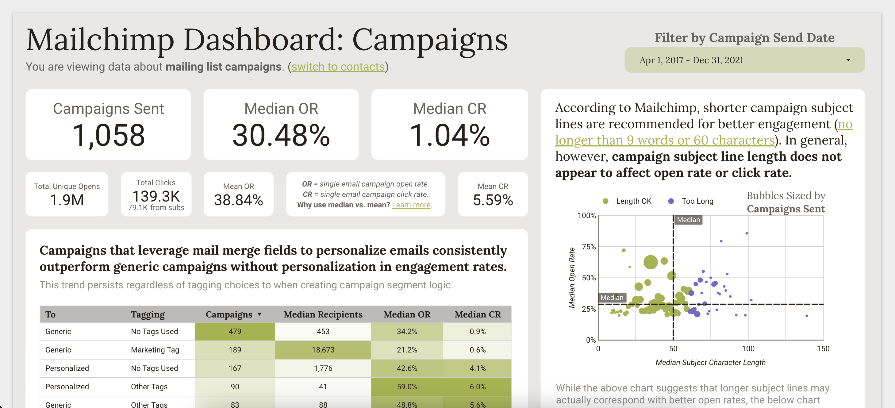
Public Garden Mailchimp Dashboard

Click to explore the interactive dashboard
Project Overview
Occasionally, I get the opportunity to dive into some data analytics consulting work, and this time, I was excited to team up with Alessi Communication & Design to explore Mailchimp data for a public garden client. We were tasked with establishing a baseline and reporting on trends for the client’s marketing performance and communications efforts in order to inform their future strategies for engaging with community members.
This project provided a great chance to get comfortable scraping data with Python, which turned out to be the most efficient method for extracting email marketing and customer engagement data via Mailchimp’s API. After obtaining the raw records, I cleaned the data and conducted an exploratory data analysis in R. Lastly, I designed an interactive dashboard to visualize my findings using Looker Studio with custom styling and formatting to match the client’s branding.
Key Takeaways
Some of the major takeaways from this analysis:
-
Personalized email campaigns outperformed generic email campaigns. We found that leveraging Mailchimp’s mail merge fields to dynamically personalize emails could lead to more opens, clicks, and overall engagement.
-
Most campaigns were sent between 2:00-4:00pm ET and 9:00-11:00pm ET. In particular, 3:00pm ET on Sundays and 10:00pm ET on weekdays stood out as frequent campaign send times. Conversely, it was interesting to me that morning campaigns between 4:00am-12:00pm ET were totally non-existent.
-
94% of all Mailchimp contacts were added via a file import, while only 5% joined via signup or embedded form. However, we found that contacts sourced from signup forms were more likely to remain subscribed compared to imports.
-
Across 8 custom interest groups designed by the client, over 80% of current subscribers were either in all 8 groups or 0 of them. The client was hoping to understand how member engagement and behavior differed by interest group. With considerable membership overlap across different groups, however, it was ultimately difficult to draw meaningful conclusions, prompting a useful recommendation to redesign groups to be more mutually exclusive.
Explore The Data
Click here or on the image above to explore an anonymized version of the dashboard.